
A modern room does not have to be white from floor to ceiling. Color can make simple furniture feel warmer and give everyday spaces more character. The hard part is often choosing what goes together. Start with the colors already in your floor, sofa, or cabinets, then try one small pairing around them. These modern home color pairings show ten clear color scenes. Some use paint, while others rely on fabrics and objects you can move. Treat them as starting points rather than strict rules. Test the shades in your own light and choose the version that feels comfortable to see each day.
Start here: Build a warm modern color palette around one surface you already like, then test a second shade with a cushion, towel, print, or sample. Check the pairing in daylight and evening light before changing a whole wall.
1. Warm White Walls With a Deep Blue Chair
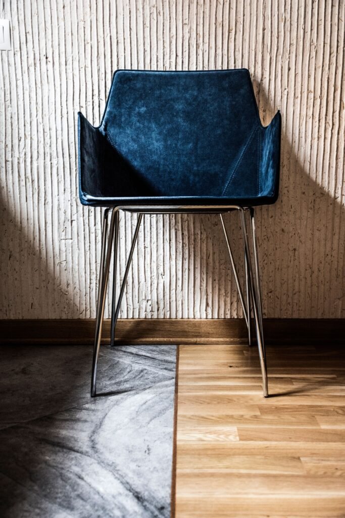
Picture a simple living room with warm white walls and one deep blue chair beside a light wood table. A plain cream cushion softens the chair, while the table gives the corner warmth. The blue is the main accent, so the wall and nearby fabrics stay quiet. This scene suits a room that needs color in one clear place.
Try a blue fabric sample beside the room’s existing sofa and floor before choosing a chair. If you already own a comfortable chair, a suitable removable cover or small throw may provide enough color. Keep the table reachable from the seat and leave space to stand. A useful chair in a color you enjoy will feel more settled than an accent piece chosen only because it matches a photo.
2. Pale Gray Cabinets With Soft Peach Kitchen Towels
A soft peach detail can warm up gray kitchen cabinets. Imagine two plain towels on a proper rail, a white counter, and one small peach bowl at the far end. The color appears in just two places, giving the kitchen a clear link without changing its permanent surfaces. Keep the rest of the counter ready for work.
Choose washable towels and place them where they can dry safely away from cooking heat. Use a bowl suited to its intended purpose and keep it out of the preparation area. Peach shades can lean pink or orange, so test a small object in the actual kitchen first. If the cabinets have a cool blue undertone, a more muted peach may sit more comfortably beside them than a bright coral.
3. A Taupe Bedroom Wall With Muted Plum Cushions
Picture a soft taupe wall behind a plain bed, with two muted plum cushions adding depth. Cream bedding keeps the scene light, and a simple dark wooden table gives it a clear edge. The plum provides color without requiring a patterned wall or several decorative layers. Keep the bedside surface useful and mostly clear.
Test taupe paint beside the room’s flooring and textiles. It can look pink, gray, or brown depending on the light. Try the cushion color first if you are unsure about changing a wall. Choose fabrics you enjoy touching and can care for easily. A bedroom should remain comfortable once the decorative cushions are removed for sleep, so give them a simple storage place rather than leaving them on the floor.

4. A Cream Dining Corner With Rust Seat Pads
A small dining corner can feel warmer with rust-colored seat pads. Imagine a cream wall, a plain wooden table, and two light chairs with simple rust cushions. One low white bowl on the table is enough. The color stays close to where people sit, leaving the rest of the room calm.
Choose pads that fit the chairs securely and are suitable for regular cleaning. Check comfort as well as appearance, and keep any ties arranged according to their instructions. If the chairs already have a strong wood tone, compare the rust shade beside them before buying. You can use a folded sample cloth to test the pairing. The table setting does not need the same color everywhere; the chairs can carry the scene on their own.
5. A Pale Green Entry Wall With a Dark Brown Shelf
Picture a pale green wall beside the front door, with a small dark brown shelf and one cream key dish. The brown gives the light color a firm outline, while the dish keeps the surface simple. A clear floor lets the wall and shelf become the focus without adding a bench or cabinet.
Test the wall color under the entry’s light, especially if there is little daylight. A pale shade on a sample card may look much darker here. Check door swings and the walking route before fitting a shelf. Use appropriate wall fixings and keep the shelf shallow enough for the location. If painting is not an option, a green print in a brown frame can give a smaller version of this color relationship.
6. A Sand-Colored Sofa With Dusty Teal and Cream
A sand-colored sofa can hold a soft mix of dusty teal and cream. Picture one teal cushion and one cream textured cushion, with a plain wooden coffee table nearby. The gentle contrast adds interest without needing a full set of patterned pillows. Leave enough seat space for people to sit comfortably.
Look at the teal against the sofa’s fabric in both daylight and evening light. Some shades may seem much brighter than expected. Try covers from another room before shopping. Choose a cushion size that supports comfort rather than simply filling the sofa. If the room already has a colorful rug, take one shade from it instead of introducing another unrelated accent. A small color plan can make mixed pieces feel at home together.

7. A White Work Corner With One Mustard Pinboard
A mustard-colored pinboard can give a plain desk a cheerful backdrop. Imagine a white desk and chair against a pale wall, with the board holding only a weekly plan and two small pictures. A dark task lamp adds a clear shape below. The board provides color and a useful job at the same time.
Choose a board size that suits the desk and the information you use. Keep papers within its edges and remove old notes regularly. Use suitable attachment methods for the household and wall. Check the view while seated so the board does not feel too high or hidden by equipment. If mustard looks too strong in the room, choose a deeper ochre or use a smaller board rather than adding more bright objects around it.
8. A Soft Pink Bathroom Wall With Charcoal Towels
Soft pink and charcoal can create a simple bathroom contrast. Picture a dry painted wall beside a vanity, with two charcoal towels on a suitable rail. Plain white fittings keep the scene clear. A small gray soap dish repeats the darker tone without taking up much counter space.
Use wall finishes appropriate for the bathroom and follow ventilation and care guidance. Keep framed art or delicate accessories away from splashes if you add them later. Choose towels for comfort and drying needs, not only color. Test the pink beside existing tiles; warm and cool whites can affect how it looks. If repainting is not planned, try pink hand towels with a charcoal accessory to explore the pairing in a smaller way.
9. A Light Wood Bookcase With Olive Storage Boxes
A simple bookcase can feel warmer with two olive-colored boxes among the books. Imagine light wood shelves, cream walls, and plain boxes on the lower shelves. Leave some open space around them. The green adds depth, while the boxes gather small items that would otherwise look scattered.
Measure the shelf openings and choose boxes that are easy to lift out. Keep heavier contents low and follow the bookcase’s anchoring and load guidance. Label boxes where useful so the storage remains practical. The green does not have to match every book spine. Use it as one steady color among the mixed covers. If boxes block the books you reach for most, rearrange the contents before adding another shelf or container.
10. A Warm Beige Hall With a Burgundy Framed Print
A burgundy accent can give a beige hall a little depth. Picture a simple print with broad burgundy and cream shapes in a thin brown frame. The wall below stays clear, and the nearby door is plain. This gives the hallway color without introducing furniture into the route.
Test the frame size with paper and view it from both ends of the hall. A detailed small picture may be hard to enjoy at a distance, while broad shapes remain clear. Use original or licensed artwork and appropriate fixings. Keep the piece away from door swings and places where bags may knock it. If the red feels heavy, choose a print with more cream space rather than changing the whole hallway.
Try One Pairing in Your Own Light
Choose a room with one main color you already like. Find a small sample of the proposed second color, such as a cloth, paper, or object, and place it where the change would happen. Check it through the day and under the lights you normally use. A color name alone cannot tell you how two shades will look together.
Start with a movable detail before changing a large surface. You may find that a towel, cushion, or print gives you enough of the new color. For paint or other permanent finishes, use real samples and follow product guidance. Keep practical needs first, including cleaning, access, and comfort. A good pairing should make the room feel more like yours without requiring every other thing to be replaced.
Common Questions
How do I make a modern room feel warmer with color?
Start with cream, warm white, taupe, sand, or wood tones already in the room. Add one quieter accent such as plum, dusty teal, rust, or olive, then test it in a movable item before changing a large surface.
Do I need to repaint to try a new color pairing?
No. A cushion cover, hand towel, seat pad, storage box, or framed print can introduce a second color. Try objects from another room first so you can judge the relationship without committing to paint.
Why does the same paint color look different in another room?
The light and nearby surfaces affect how you see a shade. Compare real samples with your own flooring, fabrics, and tiles at different times of day rather than relying on a color name or a photograph alone.
More Ideas for Your Home
warm neutral home decor ideas · modern bedding ideas · hallway decor ideas